
Transformed AgencyAnalytics with Enhanced Reports, Dashboards, and a UI Refresh
Overview
Highlights
Introduction
AgencyAnalytics is a reporting and dashboarding tool designed for digital marketing agencies. It allows agencies to connect client accounts, automate reporting, and gain insights into marketing performance across multiple channels. This project focused on a UI refresh to modernize the platform and improve usability. The goal was to enhance the overall look and feel, making navigation more intuitive and improving efficiency for users working with reports and dashboards.
Challenge
The primary challenge was working within the constraints set by leadership—they wanted a UI refresh, not a full redesign. This meant I had to find impactful ways to improve the interface without changing its core structure. Another challenge was the team's preference for enhancing existing components rather than introducing new ones. I had to find creative ways to make the platform look modern and improve usability without making drastic changes that could disrupt the user experience.
Solution
The redesign process began with a collaborative workshop involving AgencyAnalytics stakeholders, me and customers
Define
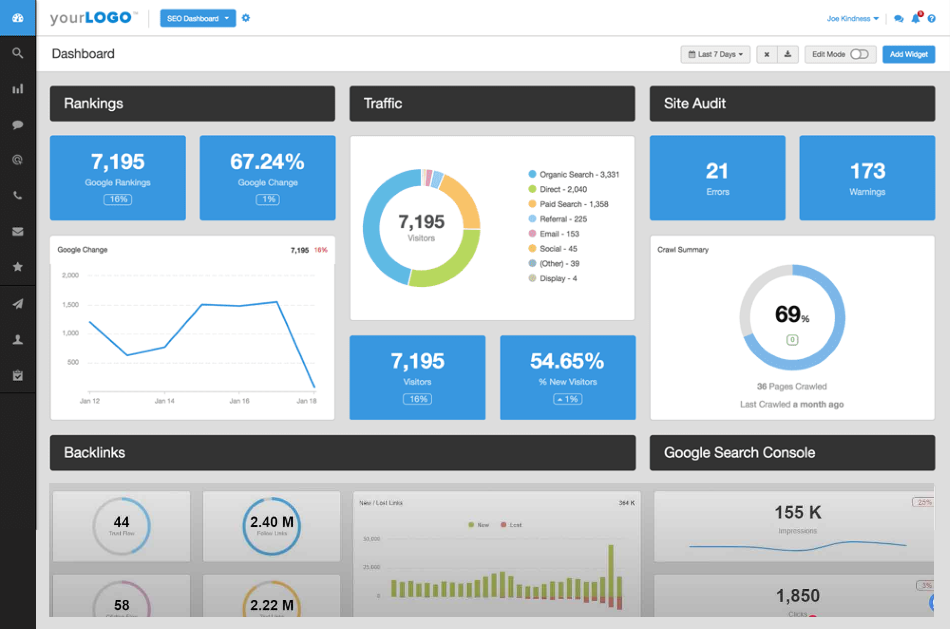
The UI of AgencyAnalytics was originally built in 2012 when the product launched. As the industry evolved, the platform’s design remained unchanged. With no dedicated designer on the team, UI updates were never a priority. By the time I joined as the first product designer and the 15th team member, it was clear the platform was falling behind competitors.
Seeing this gap, I proposed a redesign, but leadership preferred a refresh over a full overhaul to maintain continuity for users. I took the lead on this project as a Product Designer, managing and executing the entire process. My direct point of contact was CEO Joe Kindness, the main stakeholder.
Over two weeks of discussions with stakeholders, we defined the key goals for the redesign:- Increase customer signups by refining the overall UI modernizing the look and improving usability without making drastic changes, ensuring the platform remains competitive in the industry.
- Improve reports and dashboards to help users work more efficiently and simplify the user workflow.
Research
To kick off the research phase, I started by auditing the existing UI to understand what needed improvement. Since the design hadn’t changed much since 2012, my goal was to identify outdated elements that impacted usability and aesthetics. I focused on four key areas: Navbar, Sidebar, Reports and Dashboards
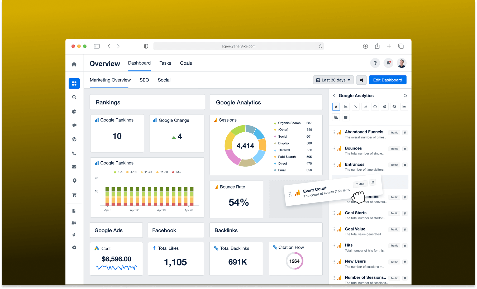
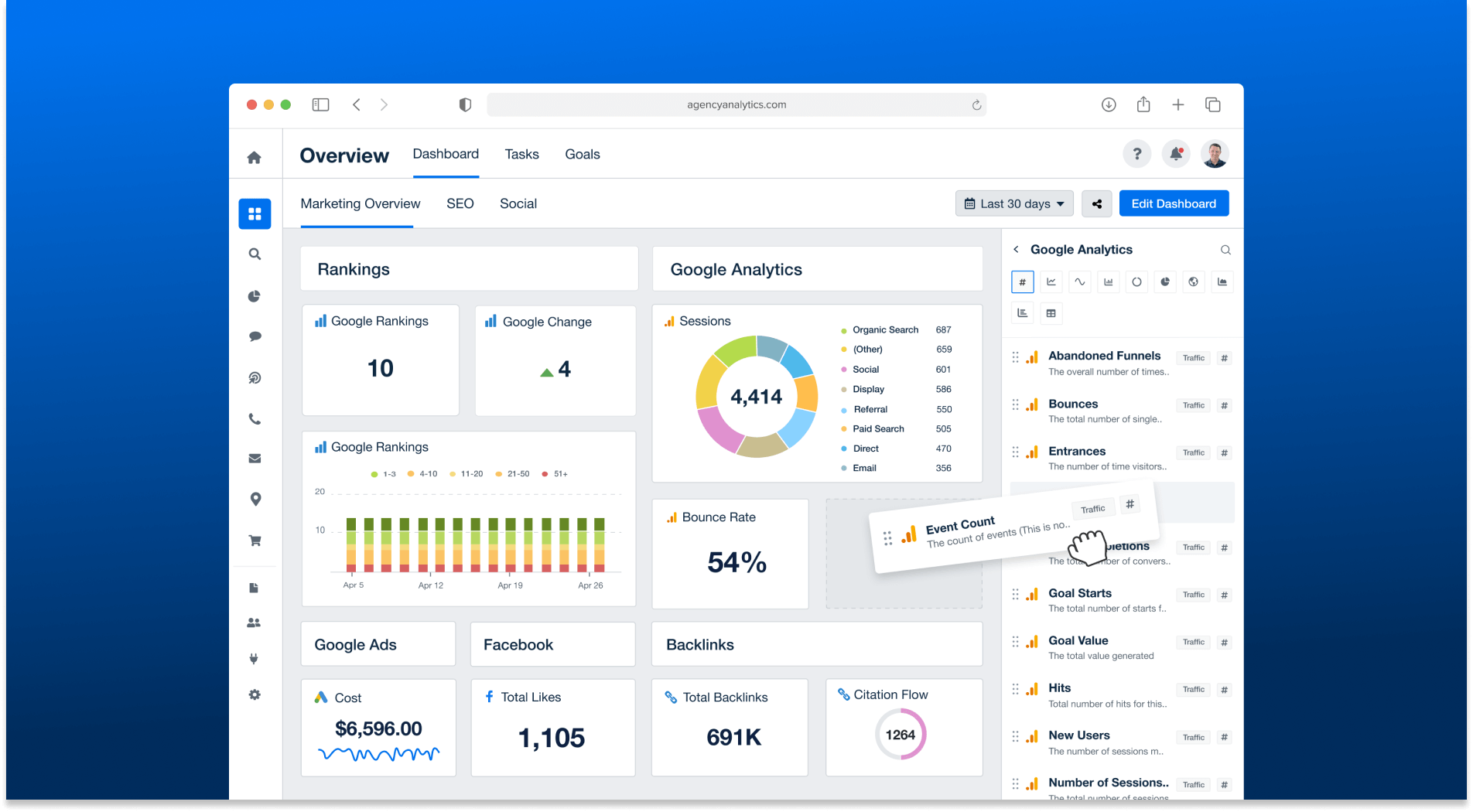
The navbar and sidebar were top priorities because they shape the overall visual impression of the platform. The navbar had outdated buttons, user info, and notification icons, along with an old brand color that didn’t feel modern anymore. The sidebar used a dark background, which made it difficult to incorporate icons or improve readability. I proposed switching it to a lighter background to create more visual clarity and room for improvement.
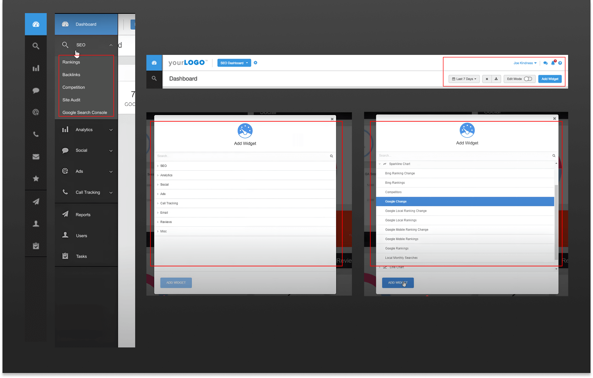
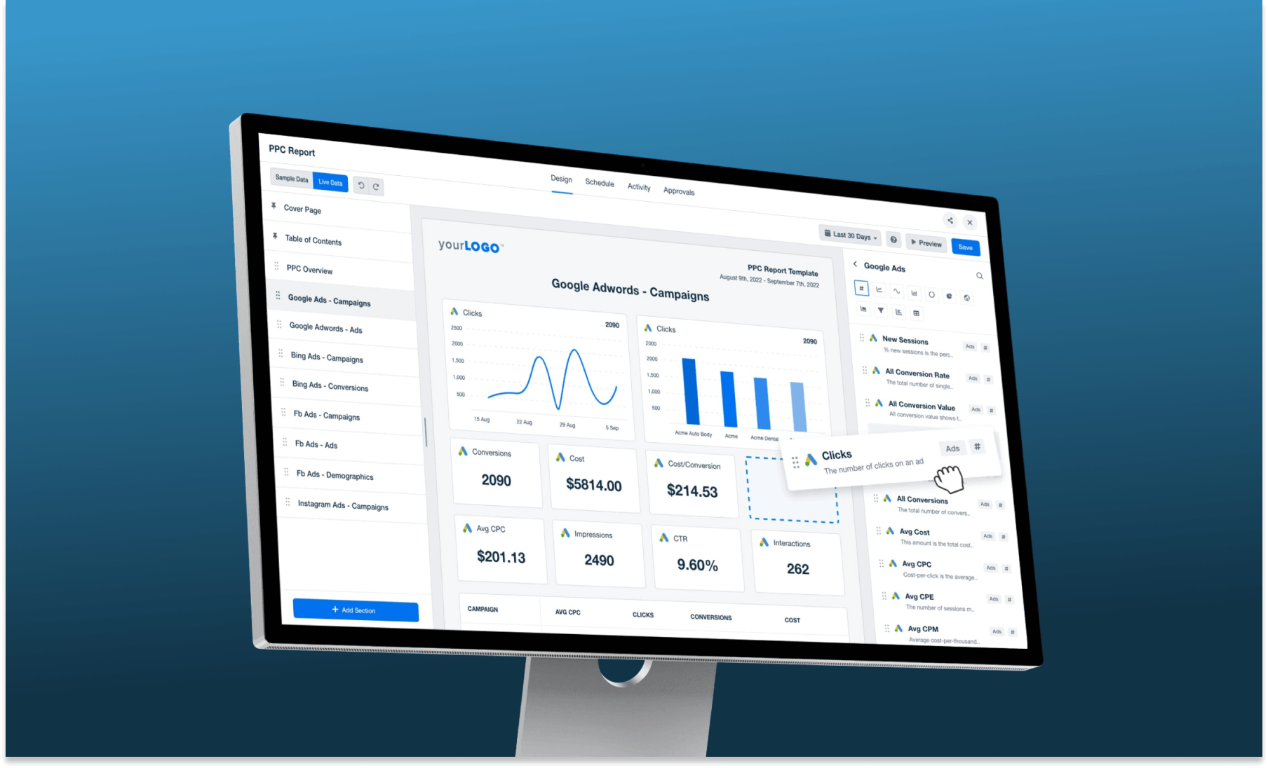
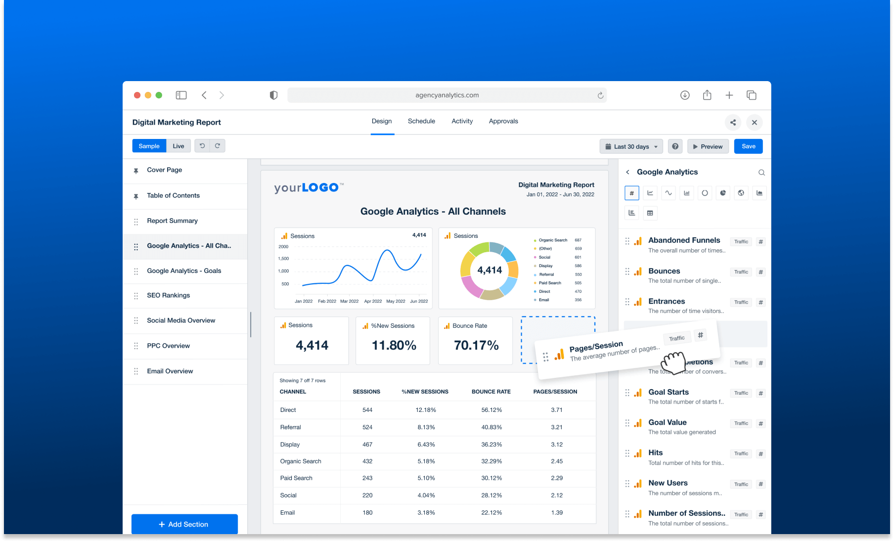
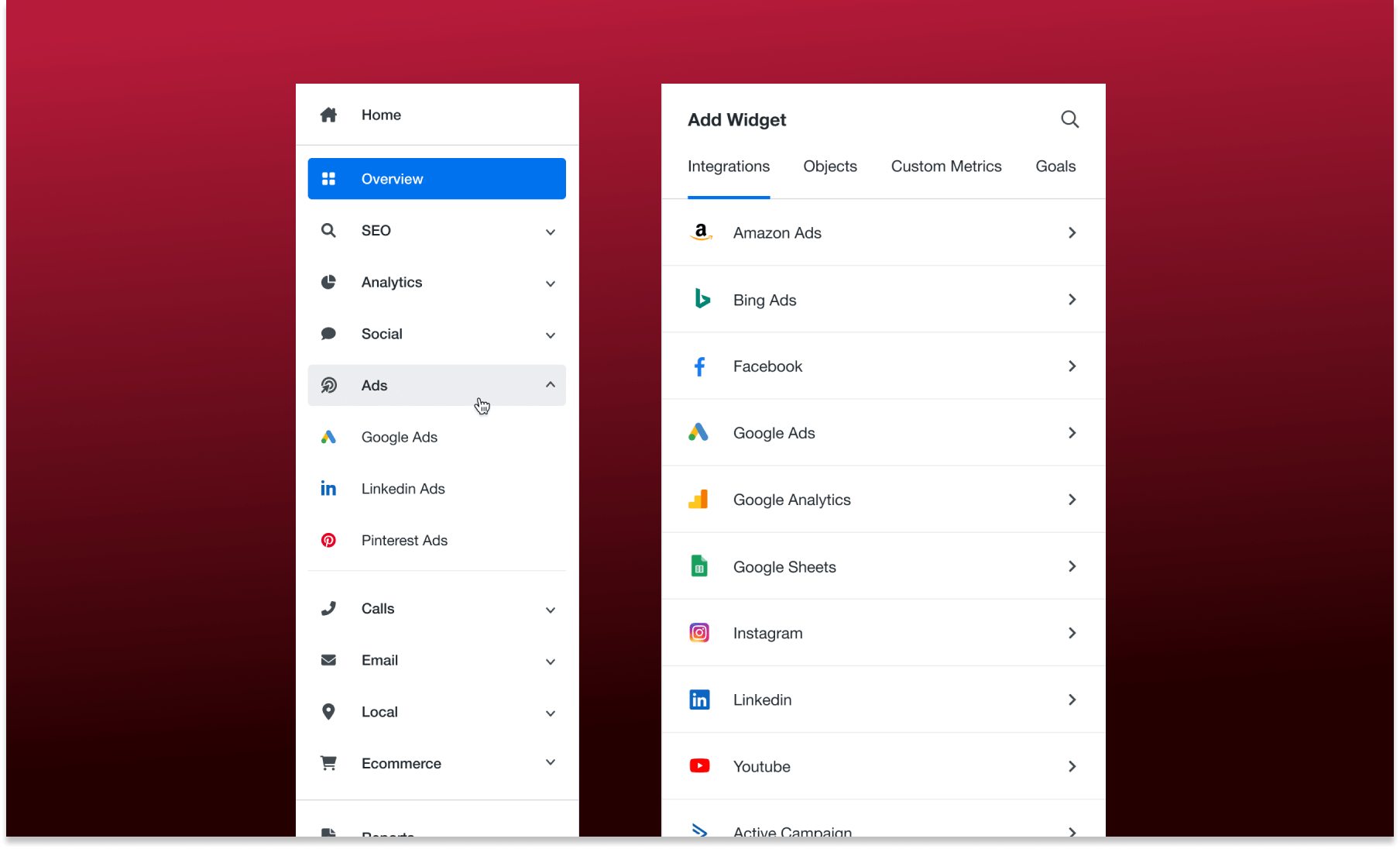
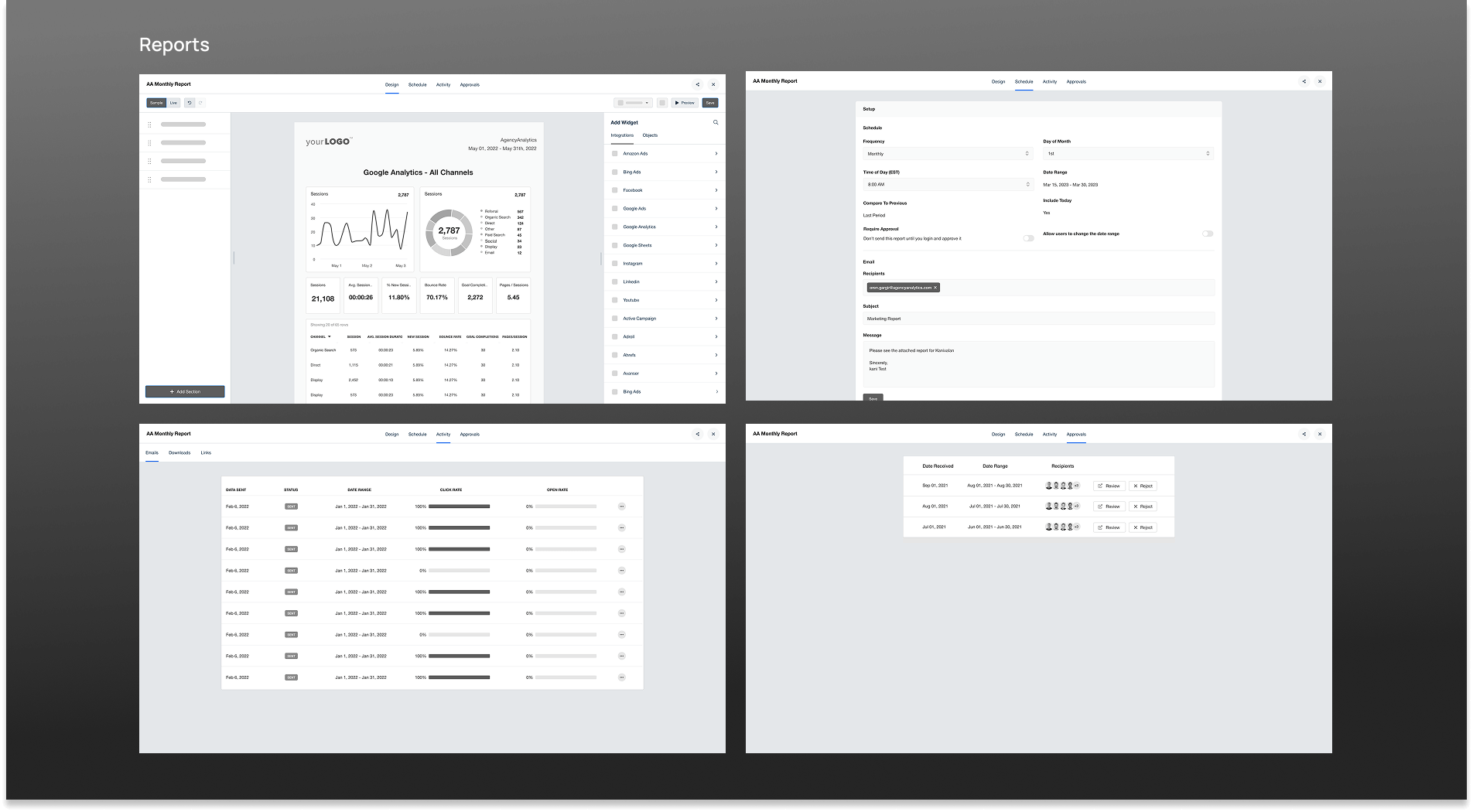
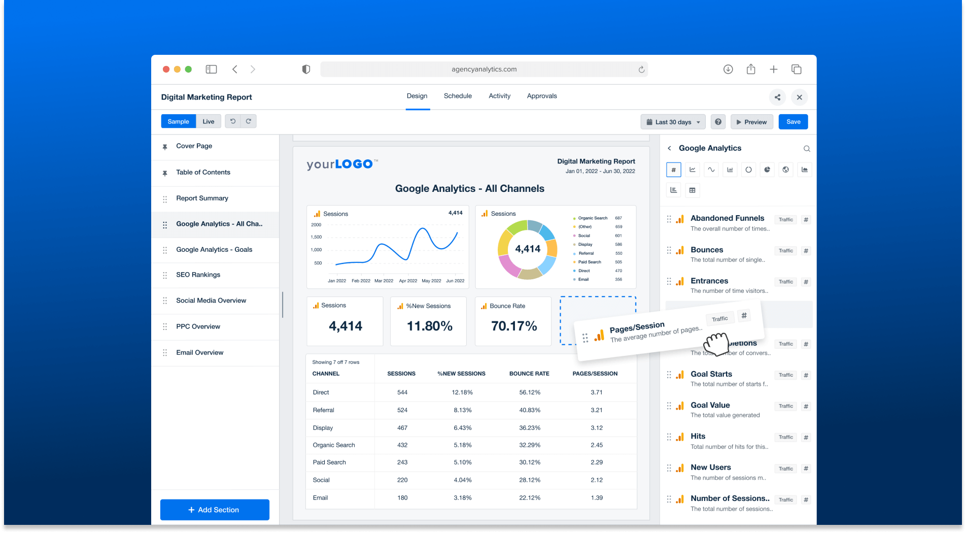
For dashboards and reports, I conducted a competitive analysis, reviewing modern report builders. Most modern tools had interactive builders, like drag-and-drop functionality, instead of the old popup-based approach. My stakeholders also preferred adding widgets directly into the builder rather than through popups.
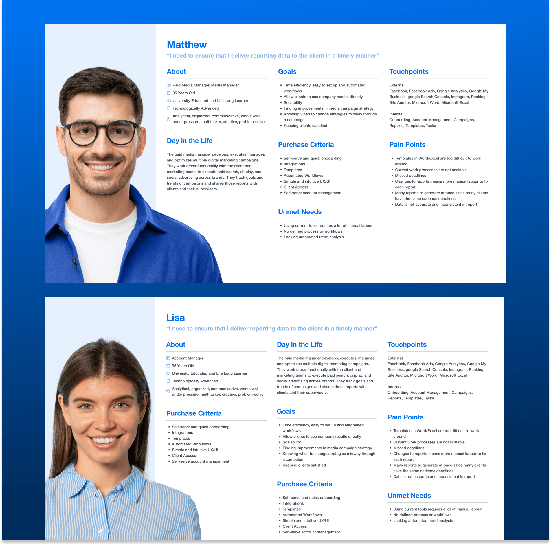
To better understand our users, I created user personas and mapped out the existing dashboard and report flows. This helped me spot key pain points and usability gaps in the experience. One major issue I discovered was the 'Add Widget' flow—it required nearly 7 clicks to complete, making the process unnecessarily slow and frustrating for users..
To further validate these improvements, I gathered user feedback from NPS surveys and G2 reviews. A common complaint was that adding widgets was time-consuming, and the dashboards and reports looked outdated. Based on this, I focused on making the widget-adding experience more interactive and seamless.
The interface is simple and does the job, but it could be aesthetically improved for a more pleasurable experience. Some of the secondary reporting elements don't dive deep enough into the data for my preference.- Jason M., Digital Marketing Specialist
Adding widgets is time-consuming and not very smooth. It takes too many clicks- Emily R., SEO Analyst
The report builder needs improvement. Right now, it feels more like just viewing the report than actually building one.- James T., Marketing Manager
Ideate
Once I had gathered both written and visual information that helped me better understand the goals of our users and stakeholders, I began the brainstorming process to explore potential design directions.
I started by sketching two key areas that required deeper structural changes and wireframes
- The Add Widget Flow
- The New Report Builder
I shared these sketches with internal stakeholders, and their feedback was instrumental in refining the ideas before moving to the next step.
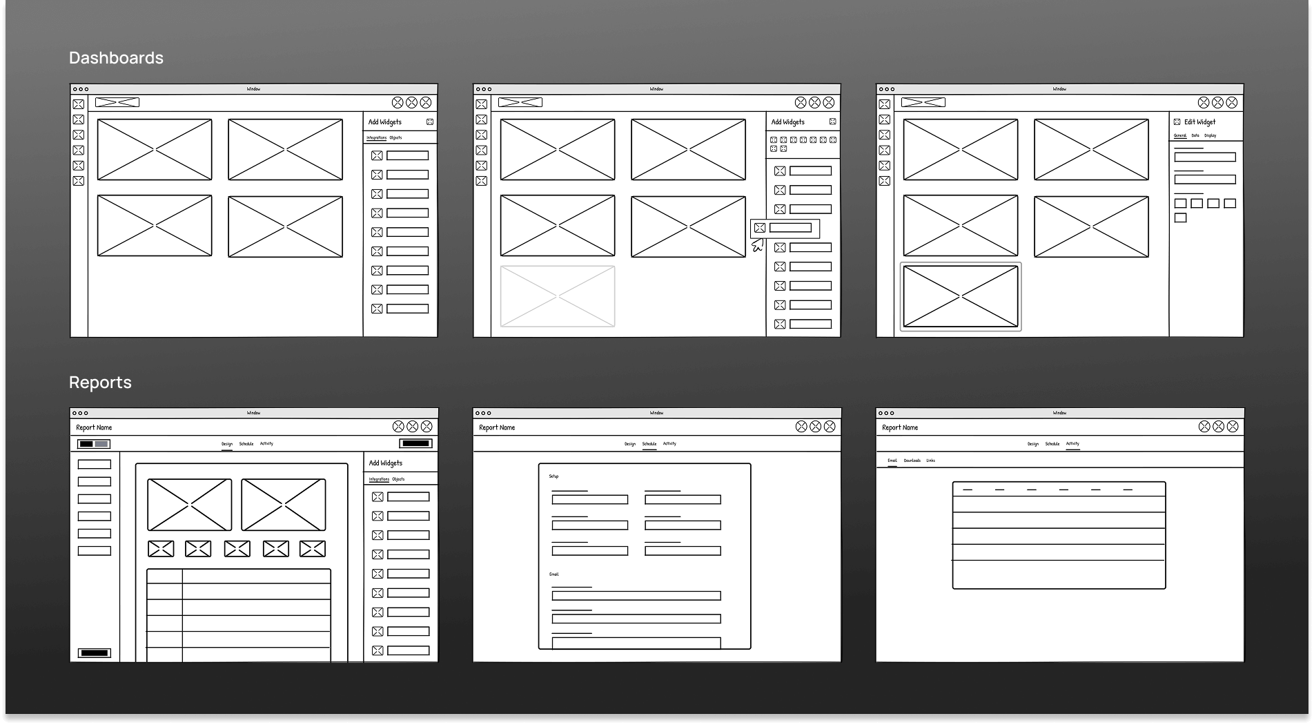
As tempting as it was to jump straight into an interactive prototype, I recognized that wireframes are the best way to test ideas and fail forward with minimal effort. Keeping that in mind, I created wireframes for both tasks and shared them with Joe (our main stakeholder) for initial feedback.
I used Figma to build and share the wireframes, inviting stakeholders to leave comments and annotations directly on the designs. After reviewing the feedback and incorporating the necessary changes, I presented the updated wireframes to all stakeholders for final approval.
Prototype
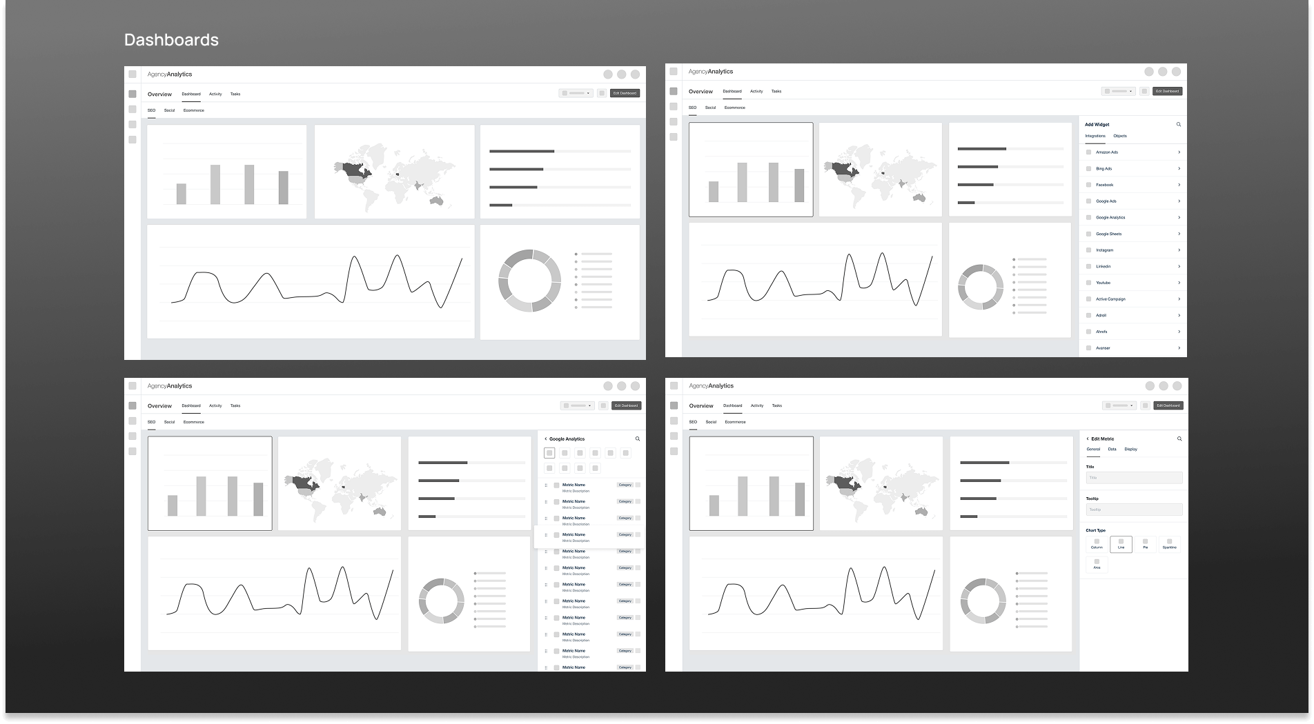
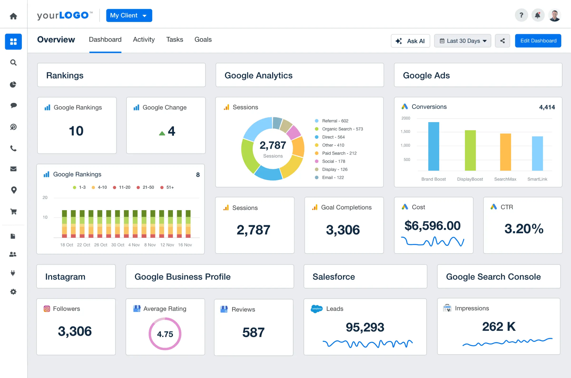
Once the wireframes were approved, I moved on to producing high-fidelity interfaces. Since the look and feel was one of the main reasons users disliked the previous dashboards and reports, I aimed for a design that was cleaner, more modern, and visually distinct from the old version.
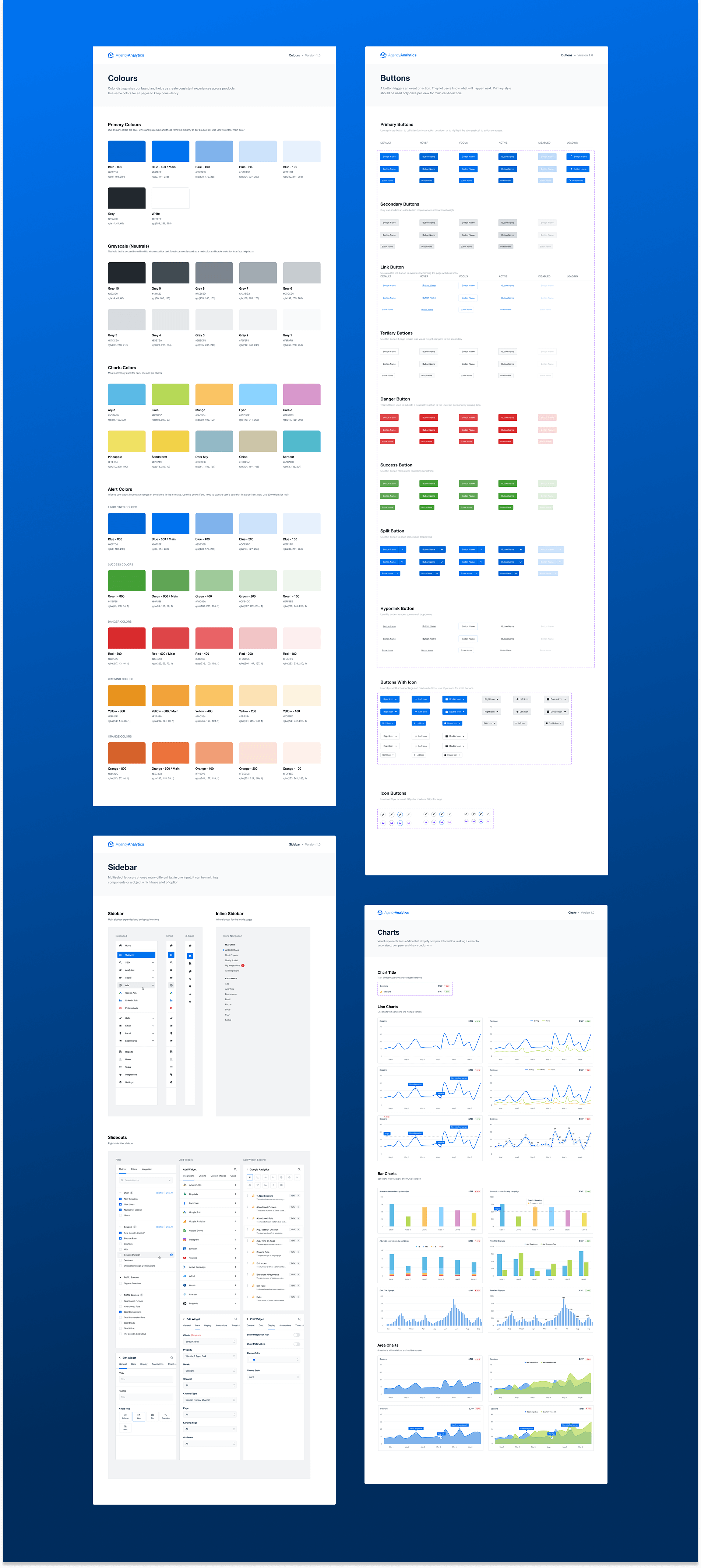
The wireframes mainly focused on the Add Widget and Report Builder flows, so here I’ll talk more about the visual aspects. I redesigned the sidebar to have a cleaner appearance and introduced a new brand color — a fresh blue (#0072ee) — to give the interface a more vibrant identity. For widgets, I added data source icons next to metrics to make them easier to recognize at a glance.
The wireframes mainly focused on the Add Widget and Report Builder flows, so here I’ll talk more about the visual aspects. I redesigned the sidebar to have a cleaner appearance and introduced a new brand color — a fresh blue (#0072ee) — to give the interface a more vibrant identity. For widgets, I added data source icons next to metrics to make them easier to recognize at a glance.
Test
Once the high-fidelity interfaces were ready, it was time to gather user feedback through a Usability Evaluation. My product manager and I recruited two participants and walked them through the prototypes. In all cases, users were able to complete tasks in significantly less time compared to the previous Add Widget experience.
We also received positive feedback — users mentioned that the new interface looked much cleaner and more modern compared to the previous UI. Following the evaluation, we received approval from the main stakeholder, Joe, as well as other key stakeholders.
Results
Post Launch, we observed a 5x improvement in the speed of adding widgets to reports and dashboards. This significantly helped users create dashboards and reports much faster than before.
In the new design, adding a widget takes just two clicks — compared to the 6–7 clicks required in the previous version. This streamlined experience made a huge impact.
We also noticed that new customers were switching over from competitors, citing our modern and user-friendly UI as a key reason for the move.
Conclusion
Redesigning AgencyAnalytics was a rewarding challenge. By modernizing an outdated interface and improving key user flows, we created a smoother and more efficient experience for users. The updated design not only improved the visual appeal of the platform but also significantly reduced the time it took to build reports and dashboards. With positive feedback from users and stakeholders—and a noticeable increase in customer satisfaction—it proved how design can drive real impact in SaaS products. This project strengthened my belief in a user-first approach and the value of thoughtful, incremental improvements over drastic changes
🏆 I received Employee of the Month recognition for the impact of the successful launch. This product is now recognized as the 🏆 3rd Easiest to Use in Marketing Analytics Software on G2.
Here is some customer feedback after the launch.
AgencyAnalytics helps me create quick, automated, and clean reports for our clients which saves me a ton of time. The UI is very clean and easy to understand and you never feel confused using it.- Willis W., VP of Marketing
The reports are clear, customisable, and actually look professional—like something you’d be proud to show off- Adam C., Director